The Aesthetic of Precision: Mastering Tactile Brutalism in 2026
1. The Death of the "Soft UI" Illusion: Why Generic is Invisible
Imagine walking into a high-end architectural firm in 2026. You expect sharp lines, glass that feels cold to the touch, exposed steel beams, and a layout that prioritizes function above all else. Now, imagine walking into an office filled with beanbag chairs, soft-focus lighting, blurry gradients, and "friendly" rounded corners that look like they belong in a cartoon. Which firm do you trust with your enterprise-grade infrastructure?
For years, the internet was dominated by "Soft UI"—an aesthetic defined by heavy drop shadows, excessive border radii, and low-contrast, blurred elements designed to feel "human" and "friendly." While this style was once a refreshing break from the rigid layouts of the early 2010s, it has reached a state of total saturation. In 2026, it is the look of generic, AI-generated website builders. It is "AI Slop."
For a beginner, Soft UI is "pretty." For an advanced digital architect, it is a performance and branding liability. We are witnessing a radical pivot toward "Tactile Brutalism"—an aesthetic that rejects the illusion of depth in favor of engineered, raw precision. At Logdart, we recognize that to command attention in a landscape flooded with homogenous, AI-generated design, you must embrace an aesthetic that feels physical, intentional, and unbreakable.
2. The Mechanics of Tactile Brutalism: Engineering the Raw
Rejecting the Illusion of "Softness"
Tactile Brutalism is not "ugly" design; it is the design of honesty. It moves away from the fake 3D shadows that try to make buttons "pop" off the screen, and instead relies on bold, explicit geometry.
The core tenets include:
* Sharp Geometry: 0px border radii (or very deliberate, minimal rounding).
* Explicit Containers: Layouts defined by 1px solid borders rather than blurred shadows.
* High Contrast: Strict adherence to accessibility standards using stark, readable color pairings rather than soft, muted greys.
The Performance Advantage of Brutalism
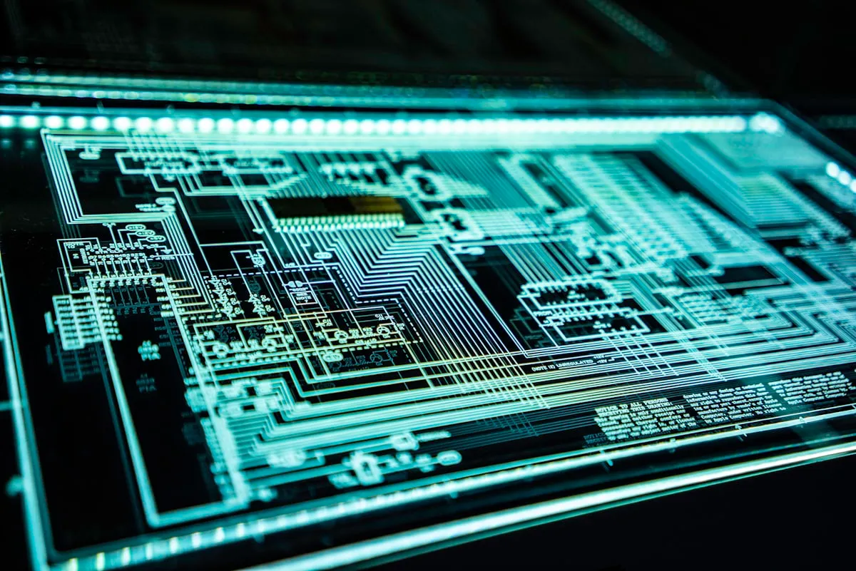
This shift is not just aesthetic; it is an engineering mandate. Soft UI relies heavily on browser-intensive effects like box-shadow and backdrop-filter: blur(), which are computationally expensive for mobile devices to render. Tactile Brutalism, by contrast, relies on geometric simplicity. A 1px solid border is a trivial operation for a browser's rendering engine compared to a Gaussian blur layer. By stripping away these heavy visual dependencies, we reduce page weight and improve rendering speeds, directly benefiting your Core Web Vitals and lowering the computational "energy cost" of your website—a critical KPI for sustainability-conscious brands in 2026.
3. Machine Experience (MX) Design: UX for the Algorithmic Era
Designing for the Bot as Well as the Buyer
In 2026, your website has two types of visitors: human users and AI agents. If your design only caters to the human eye, you are failing your business. "Machine Experience" (MX) Design is the practice of structuring your interface so that AI crawlers, generative search engines, and autonomous agents can parse your layout as easily as a human.
Semantic Architecture as a Visual Language
Tactile Brutalism aligns perfectly with MX Design because it prioritizes semantic clarity. When we design a layout with explicit, sharp-edged containers, we are essentially building a visual map that an AI model can parse with 100% confidence. There is no ambiguity about where a content block begins or ends.
This alignment between the visual hierarchy and the HTML document structure is the gold standard of modern enterprise development. When a search engine's generative AI parses a page, it shouldn't have to "guess" that a blurry, floating div is a feature list. A tactically brutalist design makes it explicit: a sharp-edged container with a clear, high-contrast header. This clarity reduces the "interpretation error" of AI crawlers, ensuring your brand content is accurately ingested into the global Knowledge Graph.
4. Typography as the Primary Interface Architecture
The Editorial Boldness
In Tactile Brutalism, photography is often secondary. Typography takes center stage. We are seeing a move toward "Editorial Boldness," where a single, perfectly kerned headline stretches the entire width of the viewport.
Kinetic and Data-Driven Type
We are no longer using static font files. We use variable fonts—typefaces that contain the entire spectrum of weight and width in a single file. This allows for kinetic interactions where the typography reacts to the user's scroll position. As the user moves down the page, headlines might fluidly expand or contract, emphasizing key brand concepts. This is not just a "cool effect"; it’s an architectural decision to use text as a dynamic, responsive UI element. By pairing an elegant Neo-Serif for headlines with a clean, high-clarity Monospace font for data, metrics, and metadata, we establish a visual hierarchy that is instantly legible and technically authoritative.
5. Engineering the Human-Crafted Edge
Breaking Digital Perfection
Digital design is often too perfect—too sterile. Tactile Brutalism uses subtle, engineered "imperfections" to signal that a human hand was involved in the creation of the platform, contrasting sharply with the perfect, generic homogeneity of AI-generated content.
CSS Noise and Film Grain
We apply subtle, performance-optimized CSS textures—like film grain or noise overlays—to background containers. This breaks up the flat, digital perfection and provides a tactile quality, similar to printed paper or cinematic film. It makes the platform feel "real" in a world of synthetic digital environments.
At Logdart, we balance these aggressive visual choices with strict performance engineering. We do not use massive image assets to achieve this look; we use math. We use CSS gradients, SVG patterns, and pure code to achieve depth and texture. By doing so, we ensure that your platform is a high-performance, AI-readable, and visually striking digital asset that commands respect in a marketplace drowning in generic "soft" aesthetics.